
Presenting Your Research Visually: Academic Posters and Slides
Barry Mauer; John Venecek; and Erika Heredia

The essay is an enduring form for presenting research, but research also appears in other forms such as visual media. Two of the most conventional forms of scholarly visual media are posters and slides. In general, both posters and slides preserve the classic structure of information organization found in essays, and include elements such as title, introduction, literature review, methodology, findings, discussion and conclusion. Posters and slides can play a supporting or collaborative role in a verbal presentation, during which the speaker refers to graphs and charts, featured images, and bullet points. Other times, posters and slides stand on their own without a speaker there to present them.

Posters
An academic poster summarizes your research in a way that is visually compelling. Made up of the harmonious arrangement of graphics, images and text, the poster can be an opportunity to engage in public speaking, share ideas, and demonstrate your expertise while networking at conferences, symposia, showcases and other scholarly events.
Successful posters have information arranged strategically and are easily readable. Some good practices include:
- Use a short and interesting title
- Make your main text readable from 10 feet away
- Only include the main ideas about your research
- Make the layout clean
- Use a text body of 300 to 800 words in a readable font
- Use bullets points, numbering and headlines to create a visual hierarchy for the content
- Use a compatible set of colors and a balanced visual structure
- Include your name, acknowledgments and institutional affiliation. (NYU Libraries, 2021)
What information to include in a poster?
Traditionally, a poster is divided into sections which organize information clearly and concisely.
- Title: brief and succinct presentation of the research. Include your name and institutional affiliation in a subheading.
- Introduction: This section is dedicated to establishing, in no more than 200 words, a context of the investigated topic. It is useful for target people outside of your field.
- Summarized literature review including the most representative authors to demonstrate the connection with the academic discussion in the field.
- Research question (see chapter XY) and the methodology proposed for addressing the research question (see chapter MN).
- Discussion including the analysis of the most important findings. You can incorporate charts, graphs and images.
- Conclusion establishing the relevance of your research, connecting once again the research question and your proposal to address it. Point out limitations, if any, and future research.
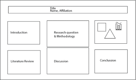
Figure 1 Landscape Academic Poster Example
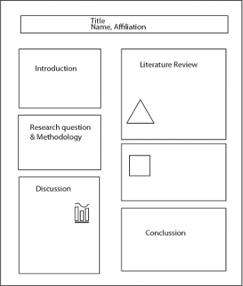
Figure 2 Portrait Academic Poster Example
Applying design principles to posters
A poster designed respecting design fundamentals must strike a balance between negative space (white space) and positive space (where the text is positioned). An overcrowded poster will discourage reading. Think about your target audience and in turn make your task easier when presenting your research.
- Consider cultural factors. In the West we are used to reading information from left to right; therefore follow this visual guide to organize your information and make it easier to the reader.
- Remember that your poster will be spotted several meters away, so consider organizing the information in blocks to make it more attractive and readable.
- The use of cold colors is recommended, in the range of blues and greens, and neutrals to establish softer transitions in sight.
- Use warm colors (yellow, red and orange) if you want to highlight certain specific phrases.
Colors and accessibility
The use of light backgrounds in contrast to dark font colors is called luminance contrast ratio and is recommended for a smooth and intuitive reading. Moreover, its use helps people with visual impairments to not miss substantial information. The highest luminance contrast ratio is the combination of white background and black font but that does not mean that you cannot combine other alternative equal accessibility friendly. Here there is a tool for helping you with picking colors for your poster https://color.adobe.com/create/color-contrast-analyzer
As a rule, if possible, use no more than 4 colors in your design and no more than 2 fonts, one for the title and one for the body. Subheadings can be bold or in a different color than the body text to bring dynamism to the overall composition.
Slides
In general, slides accompany an oral presentation. To do a slide presentation, consider your message and your audience’s knowledge, beliefs, and feelings about your topic. In this way, the slides will highlight the main points and present the evidence that supports our argument.
General recommendations
- Length: The rule of thumb is “one slide per minute,” though 1 slide every 2 minutes may work better, depending on the density and complexity of the information. The typical conference presentation is 20 minutes, which may stop at the 15 minute mark to allow 5 minutes for questions.
- Text: Avoid overcrowding the slides, and include only principal ideas. Break your text in bullet points (no need for complete sentences), use a headline per each slide, and avoid spelling and grammar mistakes.
- Fonts: use font size: 30 – 48 point for headlines, 24 – 28 for body text. Use conventional fonts like Arial, Verdana, Times New Roman or Calibri to avoid unexpected problems with the layout.
- Images: Include images and figures that are relevant for supporting your argument. Use labels for images (titles, credits, etc.).
Applying design principles to slides
Good design involves a clean and consistent layout. Many products, such as PowerPoint, provide vertical and horizontal guide markers to align elements. Your audience will group items by proximity, so put things together that go together.
Keep your presentation focused on the content and make it easy for your audience to follow. Make sure fonts are legible and large enough, and that there is some space on the slides (so they’re not too crowded). Keep slides in the same style with the same designs, colors, and fonts. Avoid animated transitions.
At the end, practice your oral presentation while reviewing the entire slide deck to confirm it has a logical organization, that the design is consistent, the text is accurate, and the images are relevant.
Software
There is specific software for designing poster layout. The most standard and popular are Illustrator, Photoshop and InDesign, all of them included in Adobe Suite. Currently, Adobe Suite offers discounts for college students that can be checked in the company website. Nevertheless, there are alternatives to Adobe Software that can deal with poster layout like Gimp, CorelDraw, Affinity Designer and MS Word.
For designing slides, the most popular are MS Power Point, Google slides, Prezi, Slide Share, Apple Keynote, Slidebean, among many others.
In recent years, there were developed online software that works with intuitive interfaces for those who are not familiar with design skills, many of them could be accessed creating a user or login through Google mail or Facebook account. Examples of them are Genially, Visme, Canva, PickToChart, DesignCap, Desygner, among others. Almost all of them allow creating posters and slide presentations that can be accessed by a computer, laptop or smartphone.
