
Chapter 5: Document Design
5.3 Principles of Design
This section explains principles of document design including grouping, contrast, alignment, balance, and consistency which aid in readability and usability of technical documents, especially tutorials.
Learning Objectives
After you read this section, you will be able to
- define grouping, contrast, alignment, balance, and consistency
- group content thoughtfully under headings to give meaning to your audience
- use spacing, color, and other contrast to highlight content and make your document visually interesting
- align all content both vertically and horizontally
- balance your pages in one, two, or three grids to provide stability to your content
- make consistent choices to help your audience understand your content
What is document design?
Document design is the placement of all elements, including text, images, icons, tables, and headings, using grouping, contrast, alignment, balance, and consistency to ensure readability, effectiveness, and usability. Document design works in tandem with the text to provide a clear message to the intended audience.
What is grouping?
Grouping, also known as proximity, is when you place elements that relate to each other closely on a page separated by active space. Narrow active space helps the audience to perceive elements as connected while wide active space separates elements and makes the audience think that the content is not related or connected (Markel, 2016). Think of elements that belong together as units of meaning, and it is up to you as the writer to make sure that the audience understands that meaning.
Grouping content does not mean writing long, dense paragraphs; instead, break your paragraphs into shorter, easy to scan ones which allow users to quickly review the content.
Spacing
Use passive and active white space wisely. Passive space is the unintentional space on a document, such as margins around the content, while active space is the intentional white space that separates chunks of content to enhance readability and comprehension.
When you write, single space your paragraphs, which should be short and easy to read, and include only double spaces between elements, including headings, paragraphs, steps, and images. Always remember that technical writers need to do as much work as possible for the user so that they are not confused. Grouping content together allows them to quickly see what a chunk of information is. Don’t think of passive or active white space as “emptiness” or wasted (Redish, 2012, p. 53) since it is necessary for user readability and comprehension of information.
Your spacing and image size affects the white space on the document, and the placement of headings allows users to quickly understand the content which will be included in each subsection and section. In addition to placing headings and content near each other, other elements, such as images, figures, and tables also need to be placed in the correct sections near the content to which it describes.
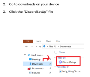
For your tutorial, all images need to be placed immediately underneath or directly to the right of the step to which it belongs. Your spacing should be consistent between text and images because if you include too many spaces, your force your users to scroll and they may be confused since the image won’t look like it is grouped with the correct step.
 |
 |
What is contrast?
As discussed in the Headings section above, different level headings need different contrast, which means that they visually look different and are enabled with header tags which can be read by screen readers. Contrast includes typographical choices of font styles as well as font style and size, color, bolding, italics, underlining, and highlighting.
Adding contrast to elements on a page allows a user’s eye to be drawn to that element and their brain to “interpret” that element into meaning (Markel, 2016). If all text and other elements look exactly the same on a page, the only way for a user to find information they need is to read all of the text, but that isn’t what users do; instead, they scan the page for important information, and by including contrast, you help that user find the information quickly.
Font Styles
Generally, you first choose your font styles, and “you can find lots of stylish fonts that are fun to look at, but if you want people to read what you put online the reader’s needs should come first, so legibility and being Web safe are key criteria (Applen, 2013, p. 230). A web safe font is one that is already installed on a user’s computer and is easy to read. In other words, don’t choose an obscure font or one that you downloaded from the web.
Font styles like comic sans or a script like Lobster are difficult to read and inappropriate for professional and technical documents, unless you are designing documents for children or users who can read cursive, respectively.
Font styles are either serif or sans serif. Serif means that the letters look like they have “wings” while sans serif are “wingless.” Most people believe that serif fonts are more ornate and difficult to read while sans serif are more informal but easier to read. Examples of serif fonts include Time New Roman and Garmond while sans serif include Helvetica and Calibri.
You need to choose a font style that works for your content, purpose, audience, and genre.
Font Size
The font size depends on your genre and audience. For example, if you were to write an essay for a literature course, you would choose a size 12 font, which is a generally acceptable and readable size. Anything less than that is difficult to read while anything above that is used for headings along with some document genres such as presentations and websites.
Clearly, if you are presenting to a large audience, your slides need to be readable, so a large font is appropriate. Additionally, web design is also different than other document genres, and a larger font size is acceptable. Similarly, a tutorial may be more readable if the base font were size 13 or 14 rather than size 12. Although less content can be placed on each page, the text is easier to read, which is important since users read as they follow the directions, so their focus is split.
Color
Color choices depend on your company’s branding as well as other considerations such as color blindness, user aesthetics, and readability. You want to use color that helps to distinguish content, is easy to read, and has high contrast. You may want to use a color wheel webpage such as this one from Canva to help you pick color combinations for your document.
Color helps documents and content be easily recognizable and allows readers to identify a “document’s structure and purpose” (Sentell, 2016). More specifically, color directs a user’s attention while defining shapes and different areas within sections, clarifying concepts, and creating affects (Winn, 1991).
Color can be problematic, however, especially for users with color blindness since they either can’t see colors or can’t distinguish one color from another. This means that you should not use color coding without explanation for user’s who can’t see the colors (Tebeaux & Dragga, 2018). According to the National Eye Institute (2023) issues include:
- Deuteranomaly: some green looks like red
- Monochromacy/achromatopsia: no color vision at all
- Protanomaly: some red looks like green
- Protanopia/deuteranopia: no difference between red & green
- Tritanomaly: hard to see differences between yellow & red and blue & green
- Tritanopia: no difference between blue & green, purple & red, and yellow & pink
Other Contrast choices
Bolding is used effectively in headings and contrasting important words in text, but don’t bold all words.
Italics can be used to draw attention to some content and always for book titles. They should not, however, be used in headings as italics are difficult to read (Redish, 2012).
One method of contrast which should be avoided is ALL CAPITAL letters which most people find difficult to read or find offensive due social acceptance of capital letters as YELLING. Reddish (2012) states that using all capital letters “is a carry-over from typewriter days” and recommends using bold or color instead since users will “ignore” the information (p. 64).
Another issue is underlining, which indicates hyperlinking. Users generally click on underlined text thinking that the text will take them to other information, and since you always want to avoid confusion, don’t use underling as contrast.
What is alignment?
Alignment is the placement of elements in a line on a page. Those lines can be vertical from the top to the bottom of the page, which includes left side justification, indentations, centering, and right-side justification. Both left and right-side justifications are to the margins of the page. Horizontal alignment is lines from the left side to the right side of the page.
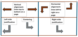
To maintain a clean look and easy reading, try to align your elements both vertically and horizontally. Doing so prevents a “cluttered” feel to the page (Redish, 2012, p. 55). For example, Figure 5.3.3, below, shows both vertical and horizontal alignment with the grey and dark red lines as well as the text boxes. The vertical alignment text box is centered above the left side justification and centering text boxes while all three text boxes in the lower section are horizontally aligned along of the top of each box.
Variations in alignment make a page look visually interesting, but your choices need to focus on making it easy to find content. When you align your text, don’t center it. Centered paragraphs create jagged left sides with the words, which is difficult for left to right readers.
What is balance?
Balance is the symmetrical placement of elements on a page to aid in readability and provide visual harmony. Balance works in tandem with alignment and grouping. For example, placing all elements along the left side margin (justification) and not including any elements on the right side will create large swaths of unused white space which will create an unbalanced document. The page is considered left side heavy.
Balance provides a feeling of stability to a page, which can be created by using grids, both invisible and visible. Invisible grids are those that you draw on a sketch page to organize your layout. They are like “fences” or a framework to help you envision where you should place your content and “forces you to see the page in abstract terms” (Barker, 2003, p. 354). These invisible “fences” let you design your pages mindfully as you write your content.
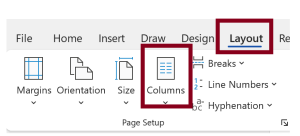
Visible grids are those show up as columns on the actual page layout using technology. Depending on your content, a two or three grid format may work better visually than a one grid layout. You can also change the orientation of your document from vertical/portrait to horizontal/landscape to give you more room for your two or three grid layout. Using these grids helps to balance your layout more effectively.
Figure 5.3.4 is an example of a one grid layout which means that the text spans from the left to the right with no column breaks:
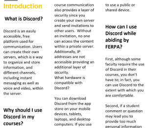
Figure 5.3.5 is an example of a two-grid layout since the same text used in the previous figure is placed in two separate columns. The space between grid columns is called a gutter (Barker, 2003):
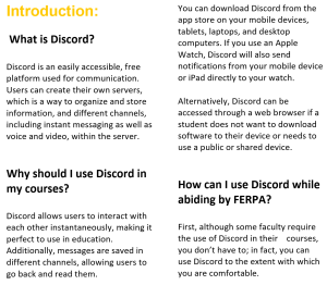
Figure 5.3.6 is an example of a three-grid layout using the same text as the previous two figures:
To create these document variations in Word, click Layout on the toolbar and then columns. You will choose which layout you prefer. You do not need to highlight any text since your document will automatically change layouts.
What is consistency?
Consistency, also known as repetition, is the use of the same elements throughout the document because your audience comes to expect it. For example, if you choose to use round, solid bullet points in one section of your tutorial, you then need to use the same design throughout the entire tutorial. This consistent design pattern leads to familiarity which your audience will come to understand as they read your document. Users will process the information more quickly through this repetition.
All design elements, including grouping, contrast, alignment, and balance, must be consistent. For example, the color choices for this tutorial include black, white, UCF yellow, UCF gold (for all glossary terms), and grey. No other colors are used due to consistent UCF branding. If a red heading were thrown in somewhere, you may be confused and wonder what it means.
Media Attributions
- spacing1
- spacing2
- alignment
- balance 1
- balance 2
- balance 3
- grids
